The security market line (graph 1) is a well known concept in the finance world. It shows the dependency between expected return and risk (which is often measured by volatility).
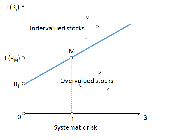
This model is widely used for finding a trade-off between return and risk. The more risk an investor is willing to accept, the more return he needs in order to accept the risk. Why should one bear higher risks, when there is no additional gain. Without an incentive, the investor would stay on the left side of the graph, at the risk-free rate of return.
I am curious about following questions:
- How is the security market line in reality (e.g. in the S&P500)
- How strong do the values deviate from the average line
- How does the line behave over time
- How does the trailing period, as a basis for volatility calculations, influence the expected returns
Unfortunately, I didn’t find any information about these questions.
In order to find answers, I did some analysis with the help of my oracle database. (for the definition of the dataset, please have a look at the article Is it worth, buying shares with a limit order?)
Limitations of the model
Unfortunately, I could only use data, available to me, as a private person. This data has some limitations. First, all companies in the index are winners (survivorship bias). Second, only stock price is measured (no dividend payments). Third, I analyzed only the top 500 US-stocks; There are thousands of public companies and it would be worth investigating them as well.
Having these limitations, the graphs could provide biased insights. Dividend payments could for example increase return for low volatile stocks. Or businesses that file for bankruptcy might decrease the returns on especially high volatility stocks.
Therefor, in order to prove the results for validity, further investigation would be necessary (including dividend payments and analyzing other markets as well)
The real security market line
The first question is how the security market line is in reality. My “reality” for this analysis is the 500 companies which are currently in the S&P500 with daily price data for the last 40 years (if available). How would the return change, if I would invest in stocks with a higher volatility?
For the analysis, I used several different methods. Two of them, I will present in this article:
- Beta (based on equal weighted market median variance)
- Standard deviation of the price (relative to the average price)
Let’s have a look at the result, based on the widely used beta. In the following graphs, there can be seen the annualized inflation adjusted leading 6-year return, compared to the beta (1 trailing year)
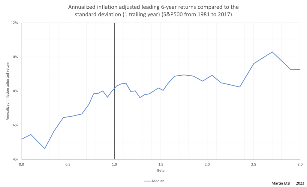
In graph 2, there can be seen a positive correlation between beta and return (as theory tell us). So, at a beta of 0.5 the median return is significantly lower than at a beta of 1. The curve flattens, as beta goes beyond 1.
How strong do the values deviate from the average line
In order to see how wide the range is, the lower and upper quartile are shown in graph 3.
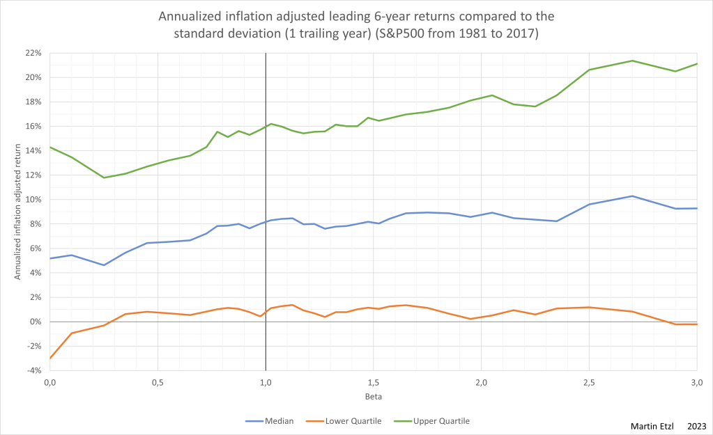
It can be seen that there is a wide range of returns. For example, at a beta=1 the interquartile range is 15%. The influence of the beta on the future returns is pretty low, compared to the wide range of possible returns. Nevertheless, there is an indication, that higher betas lead to higher returns.
A different method
Let’s have a look at a different method of measuring volatility: the relative standard deviation. I calculated the standard deviation of the daily prices related to the arithmetic average of the prices (within a certain trailing period) and set it relative to the arithmetic average of the prices. Then, I set the relative standard deviations in relation to the average relative standard deviations of the equal weighted market.
In graph 4, the median-annualized-inflation-adjusted 6-years-leading-return can be seen on the y-axis in relation to the 1-quarter-trailing relative standard deviation.
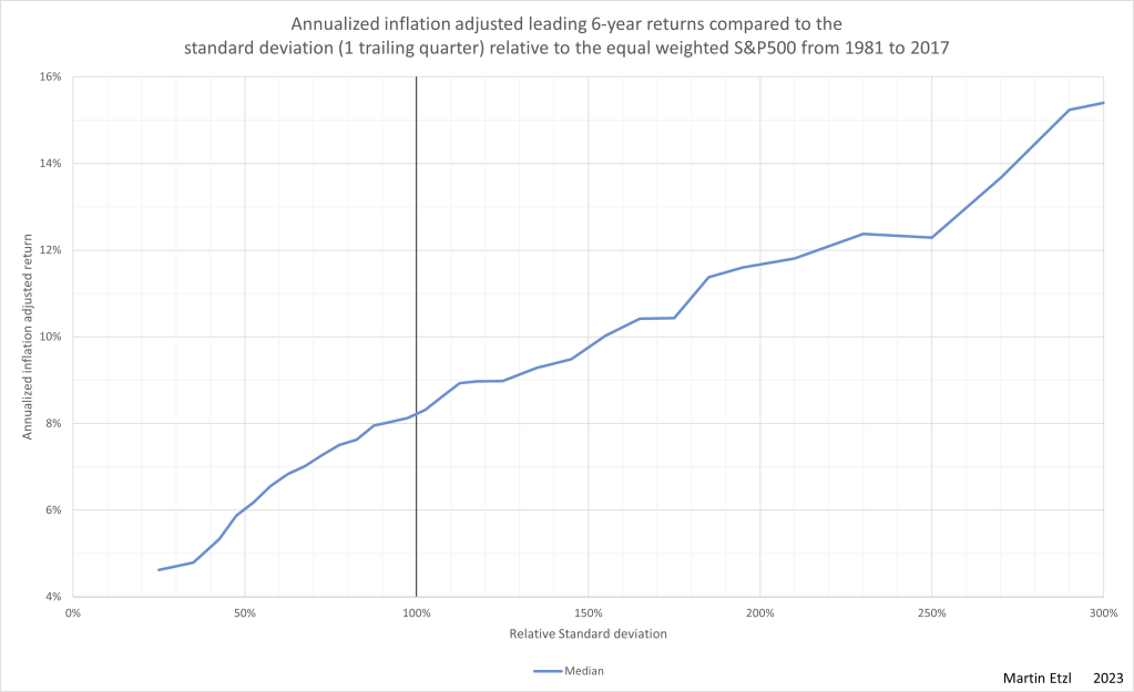
There is a much steeper slope (compared to graph 2).
Graph 5 contains the median, the lower and upper quartile.
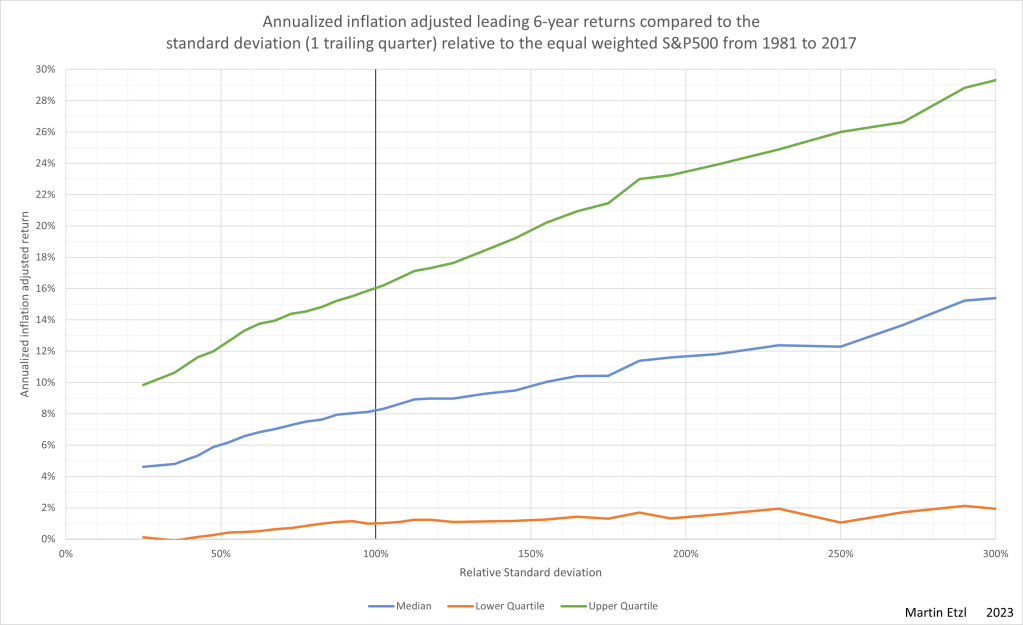
The graph shows a relatively strong correlation between the standard deviation and the return. The interquartile range is, as in graph 3, very high. This means for example, that the top performers at 50% rel. std. dev. have the same return as the average performer at 200% rel. std. dev.
In graph 6, I made a comparison between the two metrics of volatility. The relative standard deviation indicates a stronger correlation between return and volatility, than beta.

How does the line behave over time
A not so irrelevant question is, whether the behavior of the data is the same over time, or if there are peroids with different behavior. The answer can be seen in graph 7.
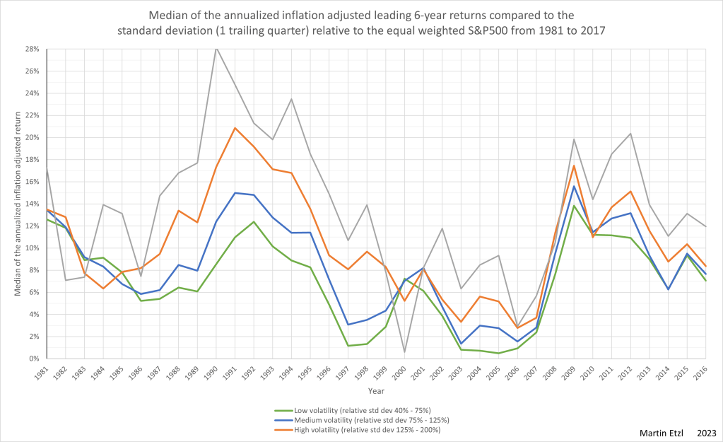
Most of the time, the high volatility stocks make higher returns than those with low volatility. There are years, where this effect is very strong (in the 90s) and years where the effect is weaker, or non existing. There can even be seen a reversion of the effect at the dotcom-bubble-burst in 2000.
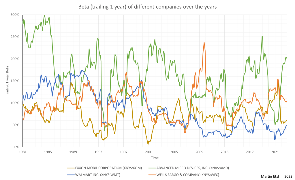
There is another question that arise. Does one company always have a similar volatility, or does the volatility change significantly over time. In graph 8, there are 4 examples and it can be seen, that the beta is highly fluctuating. For example, Wells Fargo changed from a beta of 0.4 (which should be a very save investment, according to theory) to a beta of 2.4 (a very risky business) within a short period of time.
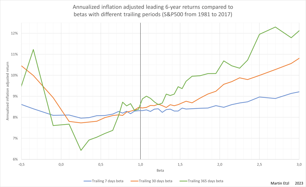
How does the trailing period, as a basis for volatility calculations, influence the expected returns
There is another attribute, that has an influence on the result. The trailing period is the period between the current date and a past date, which is used for calculating the volatility. In graph 9, it is clearly visible, that the volatility of the last week has very little to say about the return for the next 6 years. The effect on returns is already visible at the trailing month and gets stronger, the longer the trailing period is. 1 year is the longest period, I analysed.
Conclusion
Uncertainty is an inevitable characteristic of the stock market. It would be foolish to think that the market can be predicted by doing maths or statistics on price data from the past. As seen in the graphs with the lower and upper quartiles, anything can happen and nothing is predetermined.
Nevertheless, in this analysis a tendency towards higher returns at higher volatility levels can be observed.
One takeaway from this analysis for me is, that volatility shouldn’t be be avoided. At making investment decisions, better ignore volatility or seek it proactively.
Methodology
- Calculation of the returns for each stock every available trading day
- Price inflation adjustment according to the US-consumer-price-inflation
- Calculation of the returns for each stock for every available trading day
- For the leading 180 days
- For the leading 365 days
- For the leading 1095 days
- For the leading 2190 days
- Annualization of the returns (for better comparison)
- Calculation of the relative variances for each stock for every available trading day
- Calculation of the relative range between the maximum and minimum unadjusted price within a certain trailing period (rel. range = (max/min)-1)
- Calculation of the standard deviation of unadjusted price relative to the average closing within a certain trailing period (std.dev (based on min or max value of each day and the average closing price within the period)
- Calculation of the variance and covariance (compared with market median) of daily price changes, within a certain trailing period
- Cutting the results
- Companies with faulty data from my data source (~5 companies)
- The last 6 years (because the analysis wants to look 6 years into the future)
- The first year (because the analysis looks 1 year into the past)
- Calculation of the market average variance with daily equal weighting from the result mentioned in paragraph 4
- Calculation of the relative variances from paragraph 4 in relativity to the market average variance with daily equal weighting
- Calculation of beta, based on equal weighted median daily price changes, within a certain trailing period (from 7 days to 365 days)
- Relating the annualized inflation adjusted returns to the variances mentioned in paragraph 6
- Statistical analysis of the results mentioned in paragraph 4, 6 and 7
- Percentiles, Average
- Cutting the results for result-rows with limited data (for better validity)
- Exporting the result table and data examination
- Consolidation of data